Posts

CRITICAL STUDIES - amateur vs professionalism

Image
 Defining what makes an artwork professional over amateur is a difficult question because it is not necessarily made to fulfil a set of customer expectations like a commercial product or service is. I think a good way to start identifying an amateurish piece is by looking at the artists intentions - did they want the piece to look this way as a creative choice or is it down to lack of skill? The first artist I want to look at is Daniel Johnston who's work is considered to be somewhere between outsider and pop. Walk in the Truth, Daniel Johnston I like this drawing because it feels very honest, like a visualisation of Johnston's thoughts with imaginary characters that those voices are assigned to. The suicidal implications of the words are reduced to something insignificant by the silliness of the cartoon creatures and I think it's a jarring contrast of ideas. The slightly humanoid cartoon animals allude to psychedelia which was a popular theme in music during his youth, and...
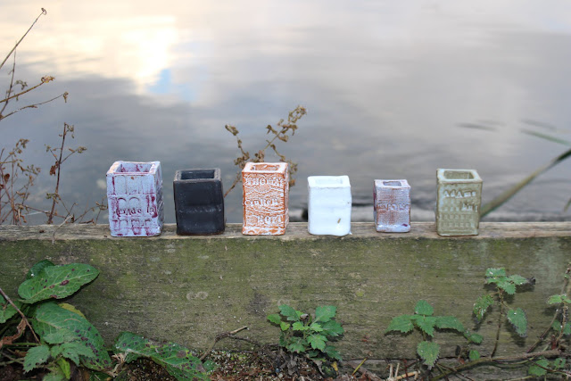
Photographing my Ceramic Buildings

Image
 My first set of ceramic buildings have finished being fired so I took them outdoors to get some photographs in a suburban setting with elements of nature. I'm really happy with how the glazes came out, the JP purple, Blue Grey and Smooth Tin White were particularly effective because you can see the text and patterns on the surface and I like that they are multi-tonal. The Smooth Black and Gloss White are really nice contrasting colours and surfaces to each other but the text doesn't show through. My favourite pictures are these ones in the shallow water because the buildings are all tilting slightly different ways which gives a sense of sinking and abandonment. The water makes me think about rising sea levels and the idea of cities becoming flooded in the future. I think the colours also work well because there are some earthy tones that fit in with the surroundings, whereas others look more artificial and out of place.  After looking at Rachel Whiteread's work and discuss...

Andrew Logan: The Joy of Sculpture at Bonington Gallery

Image
Visiting Andrew Logan's exhibition today felt like taking a step into an immersive, dream-like world of the artists imagination, with a giant wheat field and chaotic cumulations of found objects and reflective surfaces taking form as 3D sculptures and large-scale wall pieces.   This piece didn't initially draw me in but it became one of my favourites once I saw all of the little found objects and different materials that it is made up of - there are so many hidden details for the eyes to explore and it's this interactivity that I really enjoy in artwork. The model of the woman's head appears to be life-sized and gives the functional feel of a mannequin and denotations of high fashion with the added glamour of her metallic, mosaic-like hair. She is elevated on a podium of found objects that appear to be things we could easily source from charity shops and antique emporiums, so there is a sense of status being re-assigned. The tiny animal ornaments dotted around the piece...

Artist Research - Sebastian Blackie

Image
I'm interested in Blackie's work because of his use of ceramics, multiples, and natural imagery. He creates curtain-like structures with hundreds of ceramic tiles which are crudely joined together and have subtle differences is texture and colour. In the first two images Blackie has pressed different plant forms into the clay to create delicate imprints which contrast with the rawness of the materials and their assembly - these clashing themes of nature and industry are what I have been trying to focus on in my project, with imagery of the lace market and references to animals that we co-exist with in the urban environment like pigeons and magpies. I think it would be good to try using plant forms that I have gathered and see how they work together with my ceramics because I think the way Sebastian Blackie has combined them is really effective and creates a diverse, contrasting image of man-made vs natural.  

Artist Research - Freddie Robins

Image
In my research I wanted to find some examples of works that use building shapes like I plan to do for my final piece, and 'Knitted Homes of Crime' by Freddie Robins is a really interesting one. Each knitted form is based on a house either owned by a female killer or the scene of their crimes, and this website gives more information about each one: https://www.freddierobins.com/blog/knitted-homes-of-crime I think the use of materials is really clever, because knitting is associated with women - the stay at home wife - and is a comforting image of domesticity that corresponds with the actual house form that we are looking at. If we didn't know it was the home of a murderer it would be a very different viewing experience, something apparently friendly becomes sinister and disturbing once we learn the truth. It makes me feel like I should take a lot of consideration into how materials affect the message of a piece and how context is also a huge factor in changing the way we per...

Researching Magpies and Crows - Urban Myths and Superstitions

Image
One of the reasons I wanted to look at magpies and crows in my project is the strange relationship we have with them as humans and how they are perceived by society. I really like the ideas we have about them, like that they collect or steal sparkly, manmade things. The website  www.birdspot.co.uk/  suggests that despite popular belief, there is no real evidence that magpies steal shiny objects more than any other bird species, but there have been certain instances of valuables like jewellery and money being found in magpie's nests, including a platinum engagement ring and a hoard of over 1000 coins. Another article on this website talks about the folklore of magpies from various cultures and periods in history, for example; Romans - believed magpies were very intelligent and had great reasoning Ancient Greece - magpies were sacred to the god of wine, Bacchus Native Americans - wearing a magpie feather was a sign of fearlessness; magpies were a messenger of the creator; they w...

Artist Research - Michael Landy

Image
'Michael Landy (born 1963) is one of the Young British Artists (YBAs). He is best known for the performance piece installation Break Down (2001), in which he destroyed all his possessions, and for the Art Bin project (2010) at the South London Gallery. On 29 May 2008, Landy was elected a member of the Royal Academy of Arts in London.' -  https://www.tate.org.uk/art/artists/michael-landy-2409 Michael Landy, Feverfew, from the series Nourishment, 2002. Etching on paper What I like about this image is the sensitivity of the lines and the fact that Landy has included the plant's roots, whereas in a lot of artworks of plants we only see the 'pretty' side of them - this gives the drawing an informative aspect like an illustration from a botanical book. Even the colour of the background which is off-white gives the impression of book pages, and I think if it was a very bright clean white it would detract from the naturalism and rawness of the drawing. There is a lot of emp...

Bird Drawings & Photocopies

Image
  I've done a lot of loose pen and watercolour sketches recently so I wanted to do something different this time. I used a soft graphite pencil to draw a magpie and a crow and instead of the usual fluid continuous line I did a lot of short bold lines to build up the feathery texture in a more naturalistic way to my pen drawings. The other drawing on the page is my test building with some paper flowers inside, but I wasn't interested in finishing it so I moved onto drawing birds instead, and it gives an unusual composition. I made some photocopies with different colours so I could try different ways of re-working the piece.. In the black and white copy I painted some squares of colour like I did with my line drawings because I found those quite visually appealing, and I did a kind of gradient beginning with the turquoise magpie colour down to the black representing the crow. I think it brings the drawings together and creates a juxtaposition of organic and geometric shapes. The ...

4.11.21 - Ceramic Buildings part 2

Image
  This is my 2nd batch of ceramic buildings and I think making multiples will help to communicate the idea of the city space and industry. I tried some different surface patterns including lace where I rolled the clay out with the lace on top to create a detailed imprint, however I don't know how obvious this will be once they have been glazed. I also used a roller which had a grid-like pattern on it to create a window effect which is very geometric compared to the organic shapes in the lace.

2.11.21 - Making Photograms

Image
Today I learned how to make photograms in the dark room where I placed objects onto photographic paper then exposed it to light for a certain duration of time.  This was my first test piece where I covered sections of the paper up so that some areas had more time under the light, and this helped me decide how dark I wanted the image to be in my next ones.   I used some of my wire and paper sculptures and other objects to make this image and I really like the looseness of the lines that the wire creates, I think it's way more interesting than the blocky silhouettes of the leaves because there is more movement and energy. I used some lace as well because I have been looking at the Lace Market as a theme in my work, and it captured every detail like a photograph which I think is really cool. Because I found the wire effective in the last one I wanted to use more flowing lines so I used my jewellery and laid it on the paper in a very loose, meandering way and I think the solid sta...