02.12.20 - ADDITIONAL RESEARCH - The Portrait
Alfred Brendel by Tony Bevan (2005)
This acrylic on canvas painting of concert pianist Alfred Brendel was commissioned in 2005 and features in the National Portrait Gallery. My eyes were immediately drawn to this portrait because of the intense marks and strong colours depicting the details of the face. The sketchy use of the colour red implies internal aspects of the body such as blood and organs and this contrasts with the pale flesh tone of the sitters face, highlighting every groove and crease in his face. In popular culture the idea of getting old is taboo and often covered up with makeup and editing, but this portrait embraces ageing and for me this conveys the sitter as a very hard-working man who has experienced the effects of time on the human body. The viewer does not make eye contact with the subject as he appears to be looking at something to our side or behind us, which makes me feel like a moment of engagement with someone else is being captured and we are just observers of this unknown interaction. According to The National Portrait Gallery, the sharp diagonal line cutting across the bottom of the painting is a reference to Goya's 'A Drowning Dog', showing the artist's stylistic influences, and it makes me wonder what this says about the sitter - he is clearly not drowning in water but perhaps something else like stress, thoughts, or even his own music, and another suggestion of thoughtfulness is the empty space above his head. I think this portrait is informative to my project because it shows the power of something as simple yet jarring as a diagonal line off-setting the organic shapes of the subject, and the incorporation of artist references is something I want to work on more.
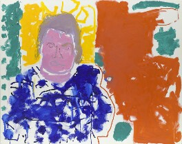
A. S. Byatt (Portrait of A S Byatt: Red Yellow Green and Blue: 24 September 1997) by Patrick Heron
This child-like abstract painting is made up of brash, energetic marks of predominantly primary colours and scribbly lines that make a playful impression of the sitter. In an audioguide interview for The National Portrait Gallery, A S Byatt said 'I think there were two reasons why I wanted an abstract painting. One is that I do not like looking at images of myself, the second reason is because I don't like, to be truthful, most representational portraits I see nowadays. What I wanted was the presence of the idea of me, not of a record of the whole of my face that I don't much like.' and I think Heron was really successful in creating this vision - there are just enough details for the sitter to be recognisable, and it implies that there is more to her essence as a person than what she looks like. The blocks of colour in the background are open to interpretation and I think the brick red colour suggests a wall, the bright yellow square behind her may be a window or painting, while the green blotches are slightly less confined to boxes and could be bushes and plants. The blue splashes of paint on her body suggest a fabric print that is floral or patterned, while the colour of her skin is exaggerated with a deep shade of pink that contrasts with the primary colours in the image. It appears that the artist has mixed several colours together to make the purplish grey shade of her hair which reminds me of what it was like to paint as a child, combining all the colours to make a strange concoction. Although the sitter's expression is not visibly smiling or very readable at all, I think the painting expresses a positive energy overall that makes me feel engaged and happy when I see it. Byatt describes it as 'a painting of the writer, of how I feel when I start work, a vanishing, watching body in a sea of light and brilliance.' and I really like the idea of depicting a subject as basking in a 'sea of light', because it is so charismatic and makes me want to try using more colour in my work, even if it looks like something I would have nonchalantly painted as a child.


Comments
Post a Comment