Experimentation - Designing Backgrounds
So far, a lot of my project has been focused on objects like toys and decorations, but I wanted to still be able to incorporate my found objects from beach combing. I figured I could do this by including them in the backgrounds of my cards, so I experimented with creating patterns based on motifs that appear on my pieces of broken pottery, with a combination of organic and geometric shapes. I used a variety of colours so I had more options for each object's background, allowing me to choose a colour way that suits that particular thing best. I also wanted to use slightly garish colours to emphasise my themes of kitsch and nostalgia, which I don't personally associate with 'sophisticated' or contemporary colour choices like monochrome.
For the first few samples I used my alcohol markers because I like the flatness and intensity, especially on the newsprint because of the distinctive way it absorbs the ink -


 |
| I think this one is my least favourite because I couldn't find any of my drawings that would look good layered on top of it, the colours didn't seem to compliment any of them. The yellow is also a bit too alarming even though I wanted vivid colour. |
Next I made some little lino cuts that I used to create repeat patterns, with alcohol marker again for the backgrounds. The patterns have a more structure to them than the pen ones because of the squareness of the edges and the way I have done some of them in a stripey grid-like pattern rather than randomly. I used newsprint again and it gives a matt/satin finish to the prints which I find very satisfying, and there is a slight graininess too that reminds me of old photographs.


 |
| I really like this one because of the variation in the ink - the lighter areas look quite golden while the darker ones feel earthy and organic, and it works nicely with the pink behind it. I think the incidental marks surrounding the motifs also give a sense of candidness, like a makers' mark. |

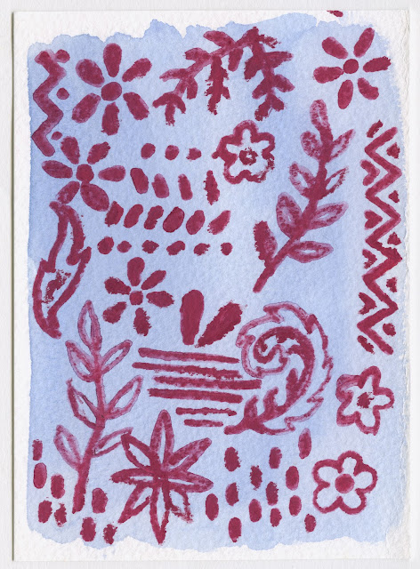
Finally, I made some with watercolour backgrounds and wet watercolour pencil on top. I don't find these so effective because they look blotchy and clumsy - they also lack the graphic style of the previous ones. I think the watercolour paper is a too visibly textured and would look too present and distracting when an image is layered on top.


Comments
Post a Comment